
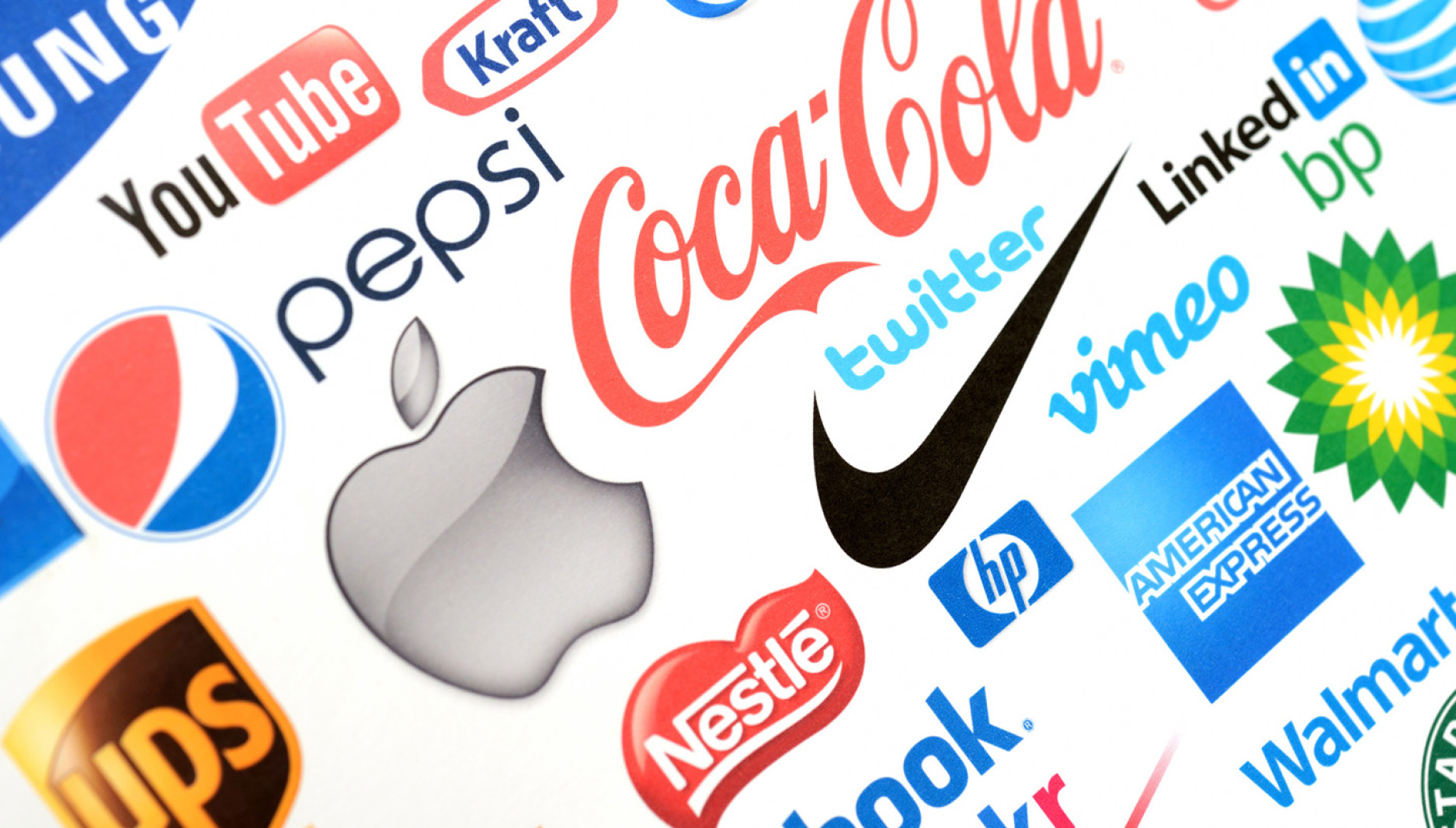
Dr. Seuss once said, “You’ll miss the best things if you keep your eyes shut.” The things we see have the power to delight and inspire, but they can also be used to identify, educate and persuade. They trigger both the emotional and rational parts of our brains, influencing the way we feel and how we behave. It is important to understand that these triggers are not exclusive to a painting in a museum or the view from the edge of the Grand Canyon – even images used for commercial purposes have the potential to provide a unique and memorable experience.
A cornerstone of this visual experience is your logo, defined as “a visual mark that represents something larger or immaterial” (a company, for example). But a logo is not merely symbolic, it can have inherent value separate from what is being symbolized. Some of the value is directly attributable to the uniqueness or beauty of the logo itself, but most of the value is developed over time. The quality and actions of the company can enhance (or detract from) the logo’s value, creating feelings and perceptions that were not there at the time of its creation. Legendary graphic designer Paul Rand put it this way, “A logo derives meaning from the quality of the thing it symbolizes, not the other way around.” A logo is a both a promise (of the experience to come) and an empty container (being filled by those experiences and interactions).
Financial institutions have begun to experience more competition from commoditized products and services, so a powerful brand image is necessary to transform audience perception into preference. The saying is true: A picture is worth a thousand words.
A (Very) Brief History
Before written language, “pictographs” were used to transfer information. Because the primary goal was communication rather than decoration, the sun became a circle, men became stick figures, and mountains became triangles, all without any loss of understanding. Using these means, cultures were able to pass along stories, draw maps, and teach their children lessons and skills. Around 3200 B.C, the Sumerians in southern Mesopotamia introduced cuneiform. Representative symbols instead became abstract wedge-shapes, paving the way for the development of alphabets and written languages.

The Crusades of the medieval period used symbols for several purposes. Clothing, flags and shields were emblazoned with a crest or a flag to encourage and embolden the troops, help generals organize the battlefield, and let the enemy know just who they were dealing with.

As societies became more sophisticated, symbols began to take on increased importance in trade. Monograms were used to indicate ownership, sign contracts or identify property. “Maker’s marks” in the form of a stamp or a seal were used to identify products from a certain family or shop and would eventually come to signify the quality of the workmanship. And the original “brands” were literally brands, seared into cow flesh!

In the 1500s, Japanese families began to create symbols known as “mon,” usually contained within circles. Design writer J.D. Reeves writes, “Much like European coats of arms, mon were handed down from generation to generation and also followed a specific set of rules. Later, mon began to be used as identifying marks for family businesses, essentially functioning as logos. A good example is the logo for the automobile manufacturer Mitsubishi, which is comprised of an abstracted combination of the mon of the two founding families.”

Visual marks today are used in the same way, to indicate ownership and to represent quality. Although ornate family crests of the medieval period have mostly been replaced by the simpler aesthetics of modernism, many of the reasons for their use remain the same.
Image Overload
In the 1970s, the average U.S. consumer was exposed to around 500 “brand impressions” each day in the form of advertisements, products and logos. In 2019, that number was estimated to have reached 5,000. I can hear you thinking, “I don’t see that many,” and to a certain extent, you’re right. There is only so much stimuli the human brain can handle, and you have plenty of practice filtering and blocking most of those impressions, so not all 5,000 fully get through your mental defenses.
Given the avalanche of brand impressions out there, your logo has to work – and work fast. And because our digital devices now fit in our pocket, there is less room to work with! The realities of the media landscape have led to a simplification and refinement of logos. Flatter, two-dimensional shapes tend to be more easily reproduced across mediums and devices. In other words, as the world has gotten more complex, logos have done the opposite. Logo simplification not only helps with consistency and identification, but it reduces the risk that the symbol itself will adopt a “style” tied to current cultural trends which can keep the logo from appearing timeless.

This movement towards simplicity has not resulted in a lack of creativity, however, far from it. Given the relatively small number of tools a logo designer has (shape, color, type, balance), there is still plenty of opportunity to create something unique to your brand and relevant to the audience. When thinking about your own brand, consider building a design “system” that can contain many opportunities to create visual interest outside of the logo itself – from the typography family to a signature color, even patterns and illustrations. Remember that the role of a logo is not to tell people everything about your company all at once (they don’t want to hear it, anyway). The role of a logo is simply to identify who you are and perhaps suggest your core purpose or value proposition. It may be the cover of the book, but the story is told by the system.

Legal Protection
Once you’ve created a logo for your brand, you’ll want some assurances that you can use it, and protect yourself from imitators that might confuse your audience. The terminology can often get confusing, so here’s a refresher. Generally, a copyright (the circle “C”) protects a creative or intellectual work and the person that creates it, and a trademark (the “TM”) applies to commercial names, slogans, products and logos. Logos that include a “TM,” have either not been registered with the U.S. Patent and Trademark Office, or have an application pending. It’s important to note that including or not including a “TM” symbol (or “SM” for services) is not actually legal protection outside of “common law” trademark rights. You do not have to visually include “TM” on the logo itself, but some companies do so to indicate common law ownership. This can keep a competitor from using your name or mark within a certain geography.
However, as customers have adopted online banking services, the defined borders of a bank or credit union’s “geography” have become a bit blurry. A brand might have common-law rights to a name and logo within their community, but also customers outside that community. While many companies decide that an unregistered trademark grants them adequate protection, those looking for a more iron-clad option will file an application with the USPTO for a “registered trademark” (the circle “R”). An application costs several hundred dollars and can take 3-4 months. During this process, the USPTO will ensure your logo is unique and legally-protectable.
Categorically Speaking
When creating a new logo, it can be overwhelming to reconcile something as a large as a company with a single graphic mark used to identify it. Because creativity can be a fluid, iterative activity, it helps to maintain a framework around the design process. By taking small steps and collaborating with others for feedback, many dead ends can be avoided before they end up draining time and enthusiasm. One of those steps is to consider which category of logo makes sense for your company. This decision can be based on many factors, from a particular characteristic of the company itself to the industry or competitive landscape.
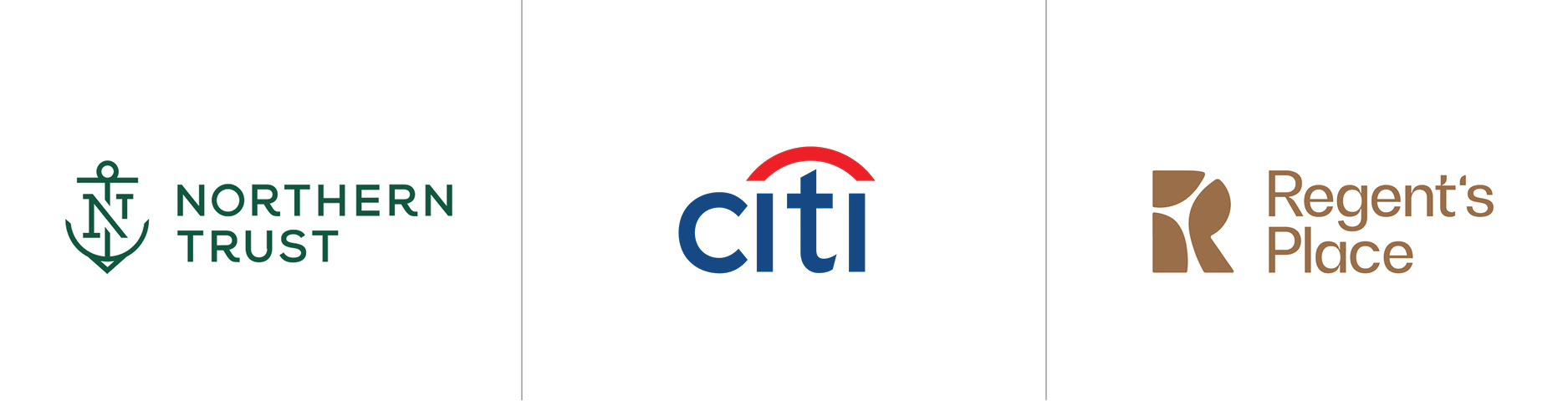
Wordmark: Sometimes the word itself contains enough value or information, and a unique, ownable mark can be created entirely with typography and color.

Maker’s Mark: Arranging an initial or monogram of the company’s name can lead to the creation of something new and distinct.

Pictoral: Logos in this category are clearly representational; they maybe stylized, but contain something easily identifiable and familiar.

Abstract: By avoiding the familiar, logos in this category have a chance to become something truly distinct. They could be based on an image or be entirely new.

A Mixture:
What Goes In….
You’ve heard that a camel is just a horse made by a committee, right? While it is true that the craft of graphic design is definitely not a team sport, it is a mistake for the process to happen in isolation. A small, hand-selected team from within the company not only provides helpful insight to the designer about the mission and goals, but can also become a powerful group of ambassadors, helping explain the reason for the new brand to the public and encouraging internal audiences to embrace and deliver the mission it represents. Through a series of facilitated workshops, this group can discuss the strategic aspects of the project, and how the visual identity system can be crafted to deliver an authentic message to consumers. Topics like color, attitude, balance, and specific-use cases can lead to the best possible design.
The cultural and lifestyle changes we are experiencing right now are extraordinary, and customers are looking for extraordinary companies with the spirit and the courage to help them through it. Now is the time to lead and inspire your team members to adopt and carry out your company’s mission as their own. Logos have been referred to as the “front door” of the brand experience, but that is not entirely accurate. Your logo – and the creative process from which it is born – can be the foundation of a brand whose consistency, familiarity and authenticity leads to trust. And that is how your company can truly make its mark.


